
How to choose your favourite take after shooting
Several photographs of the same moment can leave you with a surprisingly difficult decision. One has the expression you remember; another has a quieter background. Instead of searching for an abstract winner, begin with what you wanted to preserve. This guide offers a practical way to review your attempts after shooting and make a choice you can explain.
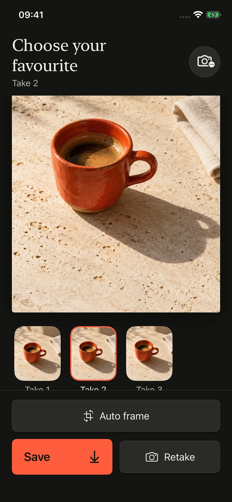
Name the reason for keeping the photograph
Before comparing small differences, complete one sentence: I want to remember this because… Your answer might be a friend's relaxed expression, the light across a cup or a colour you noticed on a walk. Keep it specific enough to guide a decision. A photograph of a cup can be about the handle's shape, the warm drink or the table where you sat; those intentions do not necessarily favour the same frame.
Choose one main priority and one supporting detail. For a portrait, the expression might come first and a clear view of the eyes second. For an object, its outline might matter most. These are personal criteria for this photograph, not a scoring system that applies to every subject.
Review the whole frame before inspecting details
Look through the available attempts once without stopping at every small imperfection. Notice which photographs still communicate your original idea when viewed as a whole. An attractive detail cannot always rescue a frame whose main subject is difficult to understand.
Keep a mental shortlist of the alternatives you actually like. There is no required number. If two photographs tell different stories, acknowledge that difference instead of forcing them into the same contest. You can decide which story you need now without declaring the other photograph unsuccessful.
Compare the important detail at a similar size
Inspect the part that matters to your intention. Is the expression the one you wanted? Can you distinguish the outline or texture that attracted you? Does a bright patch hide a detail you meant to preserve? Compare equivalent areas at similar viewing sizes wherever the review interface allows it. A large preview and a tiny thumbnail are not a fair basis for judging subtle detail.
This is a way of looking, not a claim that Take provides a particular zoom or side-by-side control. Its public demonstration shows take thumbnails and a selected photograph. Use the controls actually available to you. If a detail is too small to judge in the current view, leave that judgement open rather than guessing.
Return to the whole image before choosing
After looking closely, step back to the complete photograph. A technically cleaner detail may come with a crop or arrangement you like less. Ask whether the advantage still matters at the size in which you expect to view or share the image.
For example, a coffee photograph might show the handle clearly in one attempt but better preserve the quiet relationship between cup and table in another. If that calm moment was your intention, the second frame may be your favourite. Describe the trade-off in ordinary words rather than treating preference as proof of higher quality.
Separate selection from optional editing
First decide which existing take you prefer. Consider a framing edit as a separate choice afterwards. Otherwise it is easy to compare an edited version of one image with an untouched version of another and lose track of what you are choosing.
The Take PRO website presents comparing takes and optional Auto frame edits as separate parts of the finishing workflow. This guide concerns choosing a take. It does not assume that you need a crop, that the app will choose for you or that a modification will improve every photograph.
Save your choice and keep one useful observation
Take's public website describes reviewing attempts and saving your favourite to Photos; its demonstration screen includes a Save button. Use the app's save control and check the saved result before relying on it. This guide does not ask you to delete the alternatives or change your photo library.
Finish with one observation for a future photograph: I preferred the quieter background, or the expression mattered more than the extra space. Take PRO is for iPhone and its interface is in English. Check the current App Store listing for availability and subscription terms; this workflow does not imply that every finishing feature belongs to a free plan.